BUILDLOOP / IDENTITY SYSTEM / VERSION 2
Two loops.
One next stage.
An identity built around the product's next chapter. A mark with structure. A palette with conviction. A visual world made of the products we help create.
Download the brand kit DOUBLE LOOP / MASTER SYMBOL
01 / THE IDEA
A meaningful
stage of progress.
A POC becomes a product. A product reaches a new scale. An application finds a new audience. Each is another loop.
The identity combines the engagement instincts of games with the judgment of a product partner. It should feel professional, polished, and specific about the work.
02 / THE SYMBOL
The Double Loop B.
Two enclosed, chamfered forms make a stepped B. The second shifts forward from the first: a completed stage giving way to the next. The negative spaces remain visible in one color and at small sizes.
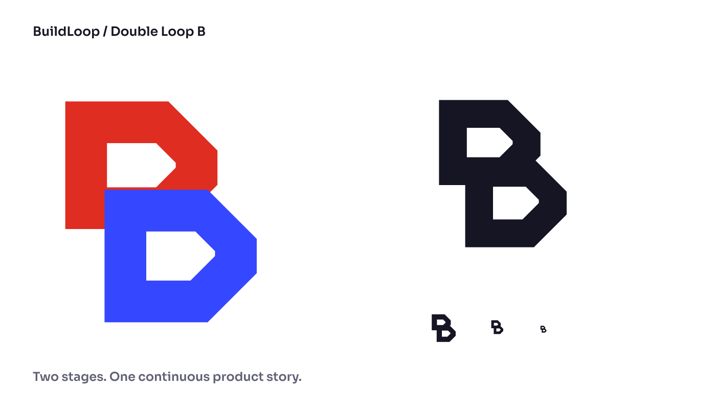

Master geometry
The symbol is drawn on a 108-unit square. Its two angular counters and forward offset are part of the identity. Keep the supplied geometry intact.
Clear space
Leave at least 16 master units around the mark and symbol-relative equivalent around the wordmark. Give the silhouette enough space to read.
Minimum size
Use the full lockup at 128px or wider and the symbol at 24px or larger. Below that, use the dedicated favicon exports.
Applications
Use the two-color identity where possible. Monochrome Ink and White variants are supplied. Preserve proportions, color order, and the stepped relationship.
03 / COLOR
Color with
a point of view.
Vermilion brings directness and action. Cobalt carries the next-stage form and major studio moments. Midnight anchors the product imagery; White keeps the business story clear.
Select a swatch to copy its HEX value.
Working text combinations
| Pairing | Contrast | Use |
|---|---|---|
| Midnight on White | 18.05:1 | Reading & interface text |
| White on Vermilion | 4.62:1 | Reading & interface text |
| White on Cobalt | 6.01:1 | Reading & interface text |
| Secondary text on White | 5.94:1 | Reading & interface text |
Flare and Pulse are expressive accents. Check text contrast for the actual pairing. The structured tokens are in the downloadable kit.
04 / TYPOGRAPHY
Strong in the headline.
Clear in the details.
Products people
come back to.
We bring product judgment, engineering, and operational systems together, so your next stage is ready to work as a business.
Reading, navigation, forms, controls, and explanations.DEFINE / BUILD / MEASURE / ADVANCE
Occasional numbering and precise annotations.Display
Use Sora at 600–700, tight tracking, and approximately 1.1 line height. Desktop display is typically 68–90px; mobile 34–52px.
Reading
Use Inter at 14–18px for primary prose, with 1.7–1.9 line height. Keep paragraphs concise and the reading measure comfortable.
All fonts are self-hosted. The SIL Open Font License files accompany the kit. The production logo has outlined lettering.
05 / ART DIRECTION
Put the product
in the picture.

The opening artwork connects a consumer application, engagement mechanics, and the operating layer behind it. Material, lighting, and composition give the imagery depth. The image has space reserved for live, accessible headline text.
Composition
Use strong focal points, asymmetric project presentations, and changes of scale. Let dark product imagery, white reading space, and decisive color fields create a deliberate rhythm.
Imagery
Show approved product work when available. Original category artwork is clearly labeled. Preserve the distinction between an illustrative visual and an actual interface.
Shape language
Chamfered corners belong to the mark and selected graphic motifs. Interface elements use restrained 4–12px radii. Keep control shapes familiar and usable.
Layout
Use an 8px rhythm with 4px half steps, 56px desktop gutters, 20px mobile gutters, and a maximum 1440px content measure.
06 / MOTION & VOICE
Show what changes.
Say what matters.
Use short, deliberate transitions to connect an action to its result. Live configuration examples should respond immediately. Respect reduced motion and keep navigation and reading available without animation.
“You have a working product. We'll help it become a business you can measure, tune, and operate.”
Professional & candid
Make the product category clear. Explain commitments and trade-offs. Use accurate evidence and attribute earlier experience to the relevant people and roles.
Polished & a little playful
Pay attention to type, spacing, and the quality of the imagery. Let the product's anticipation and possibility provide the playful element.
07 / DOWNLOADS
The working toolkit.
Vector masters, monochrome variants, favicon family, local fonts and licenses, tokens, review sheets, and social artwork.


